
Structure a Blog Homepage for AdSense Approval

A Google reviewer opens your site for the first time. There's a broken hero image, a sidebar with three empty widget boxes, and a navigation menu with a "Category" link that leads to a blank page. They haven't read a single sentence of your actual writing yet, and they don't need to. The rejection is basically already decided in the first ten seconds, because a homepage that looks unfinished tells a reviewer the whole site is unfinished, regardless of how good three of your articles might actually be.
This guide is about exactly that ten-second window: what a homepage needs to have, where it needs to be placed, and what small technical mistakes quietly sink an otherwise solid application. This isn't "make your homepage look nice." It's a specific layout structure with reasons behind every decision.
One thing worth saying up front: none of this replaces having decent content underneath the layout. A perfectly structured homepage sitting on top of five thin articles still gets rejected. This guide assumes you've already got real content, or are working on it in parallel, and just need the homepage itself to stop being the reason you get turned away.
Why the Homepage Layout Matters for AdSense Approval
First Impressions and the Human Reviewer Checklist
Human reviewers, when they do get involved past the automated first pass, move fast. They're scanning dozens of applications a day, and a homepage is their fastest signal for whether a site was built with intention or thrown together over a weekend. A clean hero section, a working navigation menu, and a content feed that actually displays real posts gets you past this stage. Anything that looks broken or placeholder-ish gets flagged before the reviewer even opens an article.
Passing Google's Core Web Vitals and Mobile Layout Tests
Beyond the human impression, your homepage gets measured against Core Web Vitals: Largest Contentful Paint, Cumulative Layout Shift, and Interaction to Next Paint. A homepage loaded with unoptimized hero images or ad placeholder scripts that shift your layout around as they load will tank these scores. Run your homepage through PageSpeed Insights before you apply. A mobile score under 50 is worth fixing before submission, not after rejection.
Establishing Immediate Topical Authority at First Glance
Your homepage should make your niche obvious without requiring a click. If a visitor can't tell within five seconds whether your blog is about personal finance, tech tutorials, or travel, neither can Google's evaluation. This isn't about stuffing keywords into your hero text, it's about a clear tagline, a coherent set of visible categories, and a content feed that reinforces the same topic rather than jumping between five unrelated subjects.
Essential Hero Section Elements That Signal Authenticity
Creating a Clear, No-Fluff Blog Tagline and Mission
Your hero section needs one sentence that says exactly what the blog covers and who it's for. "Practical AdSense and content strategy advice for freelance bloggers" does more work than a vague, inspirational line like "Sharing stories that matter." Specificity reads as intentional. Vagueness reads as filler.
Implementing Professional, Modern Header Navigation
Your header should have somewhere between four and seven links: Home, your two or three main categories, About, and Contact. More than that starts to look cluttered on both desktop and mobile. Fewer than that looks like there's nothing behind the homepage. If you're using a WordPress theme like Astra, GeneratePress, or Kadence, their default header structures are already close to this, and you mostly need to trim rather than build from scratch.
Avoiding Aggressive Above-the-Fold Ad Placeholders
Do not place any ad units, even empty placeholder divs reserved for future ads, in the hero section or immediately below it. Reviewers are specifically checking for excessive ad density relative to content, and a homepage that's visually structured around ad space before you're even approved reads as presumptuous at best and as a violation of "valuable inventory" guidelines at worst.
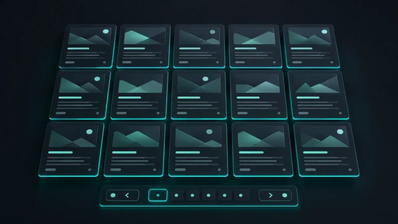
Organizing Content Feed Layouts to Show Content Depth
Ditching the Endless Scroll for Clean Pagination
Infinite scroll feels modern, but it makes it harder for both users and crawlers to gauge how much content actually exists on your site, and it tends to hurt Core Web Vitals scores as more posts load into the DOM. Standard numbered pagination, showing 8 to 12 posts per page, is the safer structural choice during the review period. You can revisit infinite scroll after approval if you want it.
Featuring Core Pillars and High-Value Categories Dynamically
Rather than a flat chronological feed, structure your homepage to feature your two or three strongest categories explicitly, either through a tabbed section or clearly labeled category blocks. This does double duty: it shows depth in specific topics rather than a scattered mix, and it gives a reviewer an immediate sense of your site's actual focus.
Ensuring Proper Text Snippets and Featured Image Alignment
Every post card in your feed needs a featured image, a title, and a text excerpt of at least one full sentence, not just a title with no context. Misaligned or stretched featured images are a small detail that adds up. If your theme is pulling inconsistent image sizes, fix your featured image dimensions site-wide before applying rather than leaving a visually uneven feed.
Sidebar Optimization for Trust Signals and UX Clarity
The Danger of Bloated Sidebars and Broken Widgets
A sidebar stacked with six different widgets (a newsletter box, a random tag cloud, three unrelated "popular post" plugins) usually does more harm than good. Broken widgets, in particular, are common on new WordPress installs where a plugin was installed, tested, and forgotten. Audit every sidebar widget individually. If it doesn't render correctly or doesn't add real value, remove it rather than leaving it half-configured.
Displaying Author Biographies and Real Creator Profiles
A short author bio widget with a real name, a small headshot or avatar, and one or two sentences about your background adds a trust signal that a generic sidebar doesn't. This reinforces the same identity your About and Contact pages should already be establishing, and consistency across all three matters more than any single one of them individually.
Linking to Popular High-Quality Content Categories
If you keep a sidebar, use it to link to your two or three strongest categories or your best individual posts, not a random auto-generated "recent posts" widget that might surface a thin article you haven't fixed yet. You have direct control over what a sidebar promotes. Use it to show your best work specifically.

Mandatory Footer Architecture for Policy Compliance
Placing Cookie Policies and Privacy Links Correctly
Your footer needs direct, working links to your Privacy Policy, visible on every page including the homepage. This isn't optional and it's one of the fastest things a reviewer checks. If you haven't written this page yet, this guide on the legal pages required for AdSense approval covers exactly which clauses it needs.
Ensuring Terms of Service and Disclaimers Are Visible
Alongside Privacy Policy, your Terms of Service and Disclaimer links belong in the same footer row, not buried in a separate menu or only linked from a single blog post. Group all your legal links together in one clearly labeled footer section.
Adding Contact and About Page Quick Links
Your footer should also include quick links to Contact and About, even though these likely already exist in your header. Redundant footer links cost nothing and give a reviewer scanning quickly a second, obvious path to verify who's behind the site.
Technical Homepage Errors That Trigger Quick Rejections
Fixing Missing Alt Text and Broken Images on the Feed
Run through your homepage feed and check every featured image loads correctly with alt text present. A broken image icon on your homepage, even on a single post card, is one of the fastest "this site isn't finished" signals a reviewer can spot, and it's usually a two-minute fix once you notice it.
Cleaning Up Hidden CSS and Broken "Lorem Ipsum" Text
Check your homepage source, not just the visible rendering, for leftover placeholder text hidden behind broken CSS. This happens more often than people expect on sites built from a theme demo that wasn't fully replaced. Search your homepage's page source for "lorem ipsum" directly; if it returns a result, you've found a real problem before a reviewer does.
Eliminating Empty Categories and Unused Navigation Items
Any category or tag linked in your homepage navigation or footer that leads to an empty or single-post page needs to be removed from navigation, or populated, before you apply. For a full breakdown of how empty categories interact with the broader "low value content" rejection reason, see this guide on fixing AdSense low value content errors.
Balancing Future Ad Placements With Current Review Requirements
Designing Whitespace for Responsive Auto Ads
You can design your homepage with the expectation that responsive auto ads will eventually slot into natural whitespace between content blocks, without actually placing any ad code yet. Leave reasonable breathing room between your hero section and your feed, and between feed rows, so that ads inserted later don't feel jammed into a layout that wasn't built for them. This is a design decision now, not a code decision.
Where to Avoid Placing Inline Banners During Review
Don't insert any ad network code, including other ad networks besides AdSense, anywhere on your homepage while your application is under review. Mixing ad networks before approval, or displaying placeholder banner images meant to represent where an ad will go, both read as premature monetization and can factor into a rejection.
- Should I use a static homepage or a dynamic latest posts feed for AdSense?
- Use a dynamic latest posts feed, not a static page. A static homepage with no visible content feed makes it harder for a reviewer to quickly assess how much content your site has and how active it is. A dynamic feed showing your most recent or featured posts is the clearer, safer choice for approval.
- Can I use a free WordPress starter theme to pass the AdSense homepage review?
- Yes. Free themes like Astra, GeneratePress, or Kadence are widely used on approved AdSense sites. What matters isn't whether the theme is free or paid, it's whether you've fully customized it, removed all demo placeholder content, and configured a clean navigation and footer structure.
- How many blog posts should be visible on my homepage when I apply?
- Aim for at least 8 to 12 posts visible on the first page of your feed. Fewer than that makes your site look sparse even if you have more posts published elsewhere. If you don't have 8 to 12 solid posts yet, focus on writing more before applying rather than trying to make a thin feed look fuller through layout tricks.
- Is a sidebar mandatory on a blog homepage for AdSense approval?
- No, a sidebar isn't mandatory. A clean, sidebar-free layout with a well-organized main content feed passes review fine, and can actually look more polished than a poorly maintained sidebar. If you're not going to keep a sidebar properly updated, skip it entirely rather than leaving a half-broken one in place.
- Should I place empty ad units on my homepage while waiting for approval?
- No. Don't place empty ad units, placeholder ad code, or any ad network scripts on your homepage before you're approved. This includes AdSense code snippets added early "just to have them ready." Wait until after approval to add any ad-related code to your live site.
Your Final Homepage Optimization Blueprint Before Submitting
The night before you submit your application, run this exact sequence: load your homepage on both desktop and mobile and check every image renders with no broken icons, click every link in your header and footer and confirm none lead to empty or 404 pages, run your homepage through PageSpeed Insights and address anything scoring below 50 on mobile, view your page source and search for "lorem ipsum" or any other leftover placeholder text, and confirm your Privacy Policy, Terms, Disclaimer, About, and Contact links are all present and correctly labeled in your footer. If all five checks pass, submit your application the next morning.
Related Articles
Explore the Blogging hub →
Legal Pages Required for Google AdSense Approval
AdSense doesn't reject good content nearly as often as it rejects blogs with no Privacy Policy, Terms, or Disclaimer page.

How to Fix AdSense Low Value Content Errors
The AdSense low value content rejection is vague on purpose, and most bloggers fix the wrong thing before reapplying.

Ideal Blog Post Word Count for New Websites
Word count is a symptom of depth, not a ranking factor, and padding your posts to hit an arbitrary number is actively hurting you.